Introduction
We we given a project to design a logo for a company called iStudio.
I started by researching logos. I found out that a logo is a small design that represents a company. Logos are for giving a visual representation of a company or brand. A logo design should be unique, give high impact, be eye-catching and leave an unforgettable impression. The logo needs to reflect the genre of the company.
A designer would have to think about colours, the fonts and elements such as icons or image. I found out there are many sorts of logos including:
The Emblem logos, e.g. Starbucks
Word mark logos, e.g. Pokemon logo
Icons or symbols logo, e.g. Firefox logo
Combinations logos, e.g.Doritos Logo
Letter Mark logo, e.g. EA logo
There are different types of genre and style of logos
Industrial, retro, modern, urban, outline, comic, graffiti etc.
Logo Description
This is a logo from a film from disney Finding Nemo, aimed at younger audiences. The film is based about the life of fishes in the ocean and the logo represents that well. In the letter "O" we can see a fish shape. The logo itself is fairly simple with white colour and the title matches follow the underline.Tool such as the pathfinder might have been used to shape the "O" to look like a fish.Using a fish shape on top of the "O" and using the pathfinder around the fish we are able to make the shape.
Nintendo is company aimed at children and teenager under 18 years old, however some adults also use it.
The Logo looks simple and easy to recreate in a program like Photoshop. It´s a word mark type of logo, as there is nothing else but the name of the company.
Red is the only colour in this logo. Also they used a classic font so the letters look the same. There isn't any texture in this logo and the typeface is the same. The red suggests having fun which is what the company would want you to have when playing their games.
Adidas is a company aimed at all ages. The logo is simple and there isn't much detail in it. It´s a combination mark type of logo as we can see both the name of the company and their icon. Black is the only colour used in this logo and there isn’t any texture on it. The shape of the icon kind of resembles a shoe which tells us they mostly sell shoes. There isn’t much space between the word and the icon. The symbols at the top can be easily created by simply creating 3 rectangles, placing them diagonally next to each other and cutting out the bottom in half using the slice tool.

Instagram is a social media website aimed at teenagers above 14 and adults. This is an icon type logo, but it could also be a combination mark logo because part of the name is there. The icon looks like a camera emphasising that you can take pictures and film with this application. There is a variety of colours in this logo. Making this logo is also easier than it looks. You can make a square with round edges using the shape tool. By using basic shapes like a circle you can make the lens and also

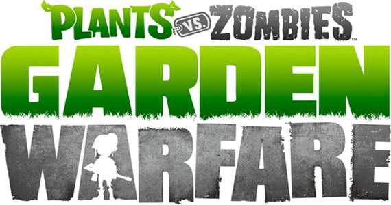
Plants vs zombies is a shooter game. The game is about a war between plants and zombies, who strive to take over the land and you can chose either side. This is a word mark type of logo and has a lot of detail on it some harder to spot then others. In the word plant you can see some leafs like a plant would have. Also the word Garden has what seems to be grass on the bottom, again like a garden. These have been clipped out from the words. Also a soldier has been clipped out from the letter A as a silhouette. The words Garden Warfare are the emphasis of this logo because they have the biggest size. There is a few of negative space in between letters and words as they are quite close together.
There are two different colours in this logo green and grey. The words plants and garden have green which is the colour of nature, a bright colour. However, the words zombies and warfare have grey which is a darker colour, which often means dull and bad. This might be suggesting that this game is about good versus evil.
This logo could be made in a program like Photoshop. The letters are placed using the type tool using a particular font without serifs. The design looks balanced as the garden warfare words are the same length and the plants vs zombies sits on top and there is equal space either side. Some of the letters are tilted and not aligned. This suggests something might have happened and gives a feeling of unease.
The gradients on the words have been made using the gradient tool. Gradients can be easily changed by selecting colours and changing the stop. The roughness on the letters could be created by clipping the letters. It could be made by using the eraser too on the letters.
Wii sports is a type of sports game. This is a combination mark logo. There isn’t much detail in the words of this logo. Both words have a classic font, but the word sports has italic on it. There are 2 different colours in this logo, the word Wii is in grey and the rest is blue. But there isn’t any texture. The icons show each sport you could play in this game, they were making a blue background and using white draw the shapes. There is a few negative space between the icons and the words.
This logo could have been made in photoshop or any other drawing programme.
Logo Making
I have been asked to make a logo for a company named iStudio in either 2D or 3D.
I did some sketches in my sketch book, to gather some ideas for the logo.
I started to research online art styles and I started thinking what would make the look artistic and thats when I though about and I found some pictures of pallets
This one is a more realistic drawing of a pallet
This one is more cartony and 3D ish
This one is a real picture of a pallet
I got inspiration from theses images and tried to recreate my own logo using theses ideas in Illustrator.
This is what I originally came up with. I noticed that every pallet had a hole in it for holding so I decided to put the hole on the O.
I then realised that the the position of the hole is different so I changed it. This is what it looked like in the end.
Reference:
https://www.graphicsprings.com/start-your-logo
https://nodinx.com/5-basic-types-of-logos/ (Jan. 2017)
E.g. Warr M. (1999). Coloured Pencils for All, Devon: David and Charles.
Moleskincity. (2007, June, 21st).
Moleskine Paula Scher notebook@Detour exhibition. Retrieved from
https://www.youtube.com/watch?v=I7M7U8rP_K8
I used theses references to get some inspiration and ideas for my logo. For example, after watching Paula Scher's youtube video about her notebook I tried replicating some of that on my sketch book.


